grandMA3 User Manual Publication
Edit Layout Elements
|
grandMA3 User Manual » Layouts » Edit Layout Elements
|
Version 2.1
|
To edit a layout element:
- Tap Setup to activate the setup mode in the Layout View window.
-
Tap
 and open the element with the 2-finger edit.
-Or-
- Tap Setup to activate the Layout Encoder Bar.
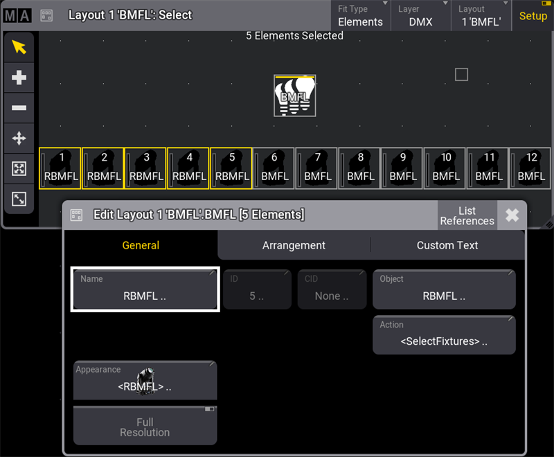
- Select the layout elements to edit in the Layout View window.
- Tap Edit Selected in the Layout Encoder Bar to open the layout element editor.
The Edit Layout window is separated into three tabs. General, Arrangement, and Custom Text.
General Tab
Manages all properties regarding the object assigned to the layout element.
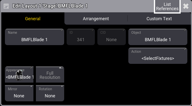
- Name: Opens the virtual keyboard to enter a name for the selected element.
- ID: When a fixture is assigned to a layout, the fixture ID is displayed here. For more information, see What are fixtures. When a pool object is assigned, ID represents the pool object number.
- CID: If the IDType is something different than "Fixture", the CID is displayed here. For more information, see Add fixtures to the show.
- Object: Opens the Assignment Editor pop-up.
- Action: Opens the Select Action pop-up. Select an action to be performed when tapping the element. Selecting <Default>, will set the default action for the assigned object. For example, if the assigned object is a fixture, the default action will be <SelectFixture>.
- Appearance: Opens the Select Appearance pop-up. <Default> will use the appearance of the assigned object. For more information, see Appearances.
- Full Resolution: Defines if an image is displayed with its full resolution (enabled) or reduced quality (disabled).
- Mirror: Mirrors the displayed appearance on a layout element horizontally, vertically, or equally.
- Appearance Rotation: Rotates the displayed appearance to 90°, 180°, or 270° degrees.
|
Important: |
|
Having a lot of high-resolution images displayed may slow down the graphical user interface. In this case, the software falls back, rendering images with a lower quality. Images with 150 pixels or below will always be displayed with a lower quality.
|
Arrangement Tab
Manages the position and look of a layout element.
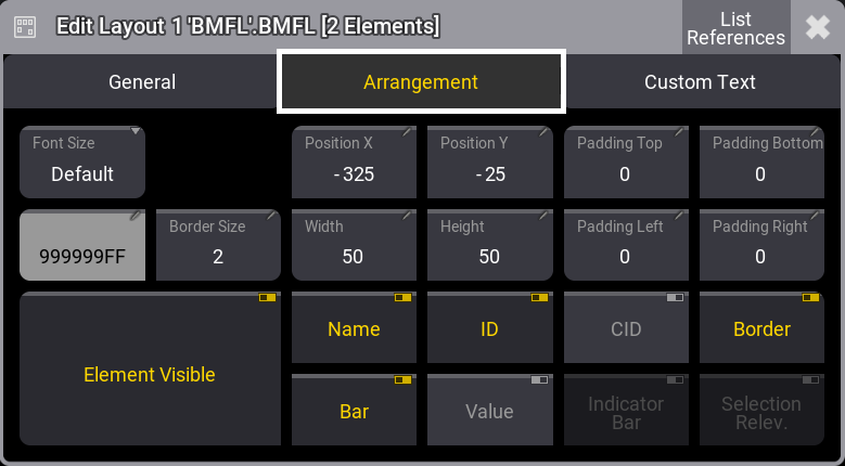
- Font Size: Use these buttons to personalize the custom text alignment. Setting layout elements to a dedicated font size displays the text in the set size.
- Position X and Position Y: Specify the position along X and Y in the layout.
- Padding Top, Padding Bottom, Padding Left, Padding Right: Padding is the distance between the edge of the element and the content inside the element.
- Border Color and Border Size: Adjust the outline color and size.
- Width and Height: This is to adjust the dimensions of the element.
- Element Visible: Toggle to display or hide the element.
- Name, ID, CID, Boarder, Bar, and Value: Toggle to display or hide the name, the fixture ID, the custom ID, the dimmer bar, the output value, and the border of the layout element.
- Indicator Bar: When a pool object is assigned to a layout (e.g., a group), it defines if the indicator bar will be displayed on top of the element.
- Selection Relevance: When enabled, the image of the layout element will be colored with the For All or For Some color. For more information, see Window settings, Pool Settings.
Custom Text Tab
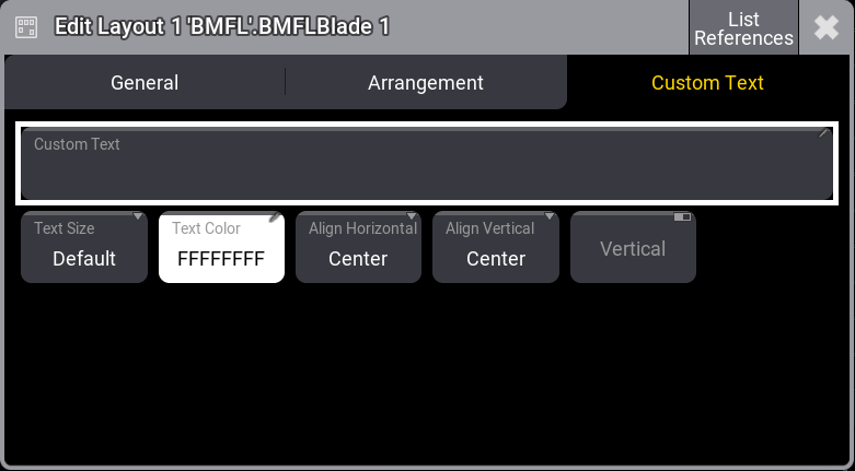
- Custom Text: Add a custom label to the element. Text on layout elements that is too long to display is cut off.
- Text Size and Text Color: Use these buttons to personalize the custom text size and color.
-
Align Horizontal: The horizontal custom text alignment.
- Center: Will align the text to the horizontal center of the layout element.
- Left: The left end of the text will be aligned with the left edge of the layout element.
- Right: The right end of the text will be aligned with the right edge of the layout element.
- OutsideLeft: Places the custom text outside of the layout element on the left.
- OutsideRight: Places the custom text outside of the layout element on the right.
- Align Vertical: The vertical custom text alignment.
- Center: Will align the text to the vertical center of the layout element.
- Top: Places the text within the layout element at the top edge.
- Bottom: Places the text within the layout element at the bottom edge.
- Above: Places the text outside the layout element at the top edge.
- Below: Places the text outside of the layout element below the layout element.
- Vertical: Displays the custom text in vertical direction when enabled.
|
Hint: |
|
Multiple selected layout elements can be edited simultaneously. |
|
|
Hint: |
|
The layout element selection order will determine the alignment order.
|
|
|
Hint: |
|
When toggling layout element properties while having multiple layout elements selected with different property values, they will switch to the same value and change their value together.
|
Example
To edit multiple selected layout elements simultaneously:
- Tap Setup in the title bar to enable Setup.
- Select multiple fixtures in the Layout Viewer window.
- Tap Edit Selected in the Layout Encoder Bar to open the layout element editor. For more information, see Layout encoder bar.
- Tap the Name button; this opens the virtual keyboard. Enter a new name and tap Enter.
- Close the Edit Layout dialogue.